LA Fitness | Fitness Platform
I redesigned LA Fitness' website with a scalable design system, improving its look and feel while making navigation easier, and site maintenance more efficient.
Web Design
Health Club

Overview
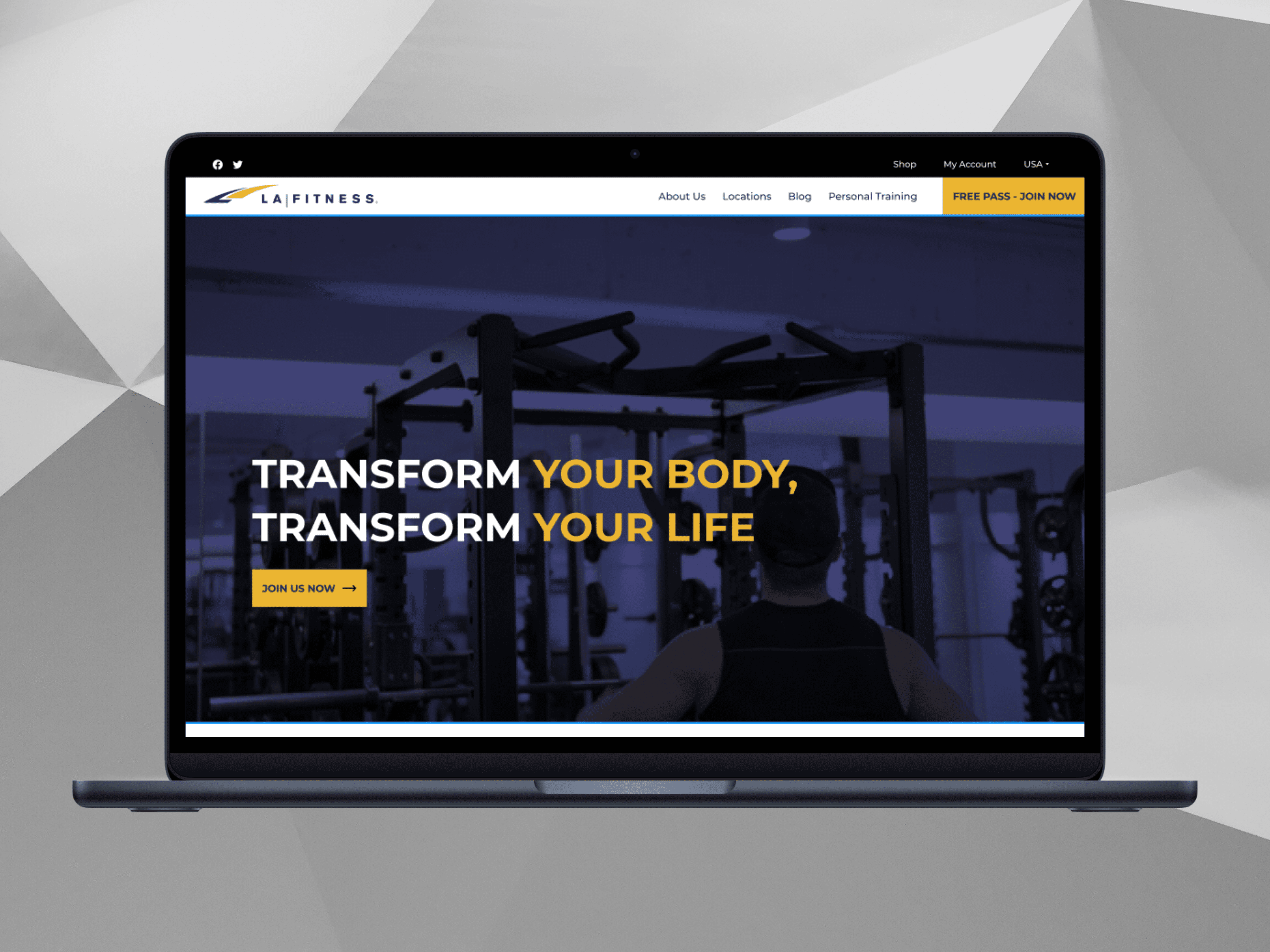
LA Fitness is a well-established gym chain, they empower people to find their fit through unique classes and high-intensity workouts and its homepage is frequently seen by users as it is the first page one would land upon when they visit the site. The goal was to redesign the entire site, with a particular focus on the homepage to make sure that important sections are clearly communicated and strategically placed, rather than requiring multiple steps to access.
Challenge
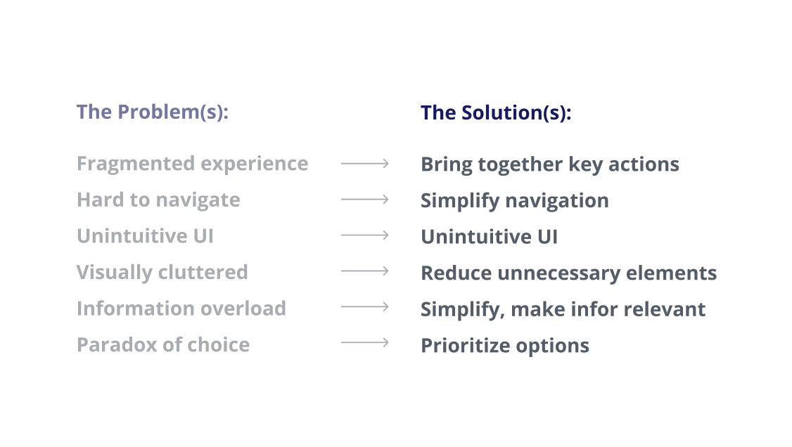
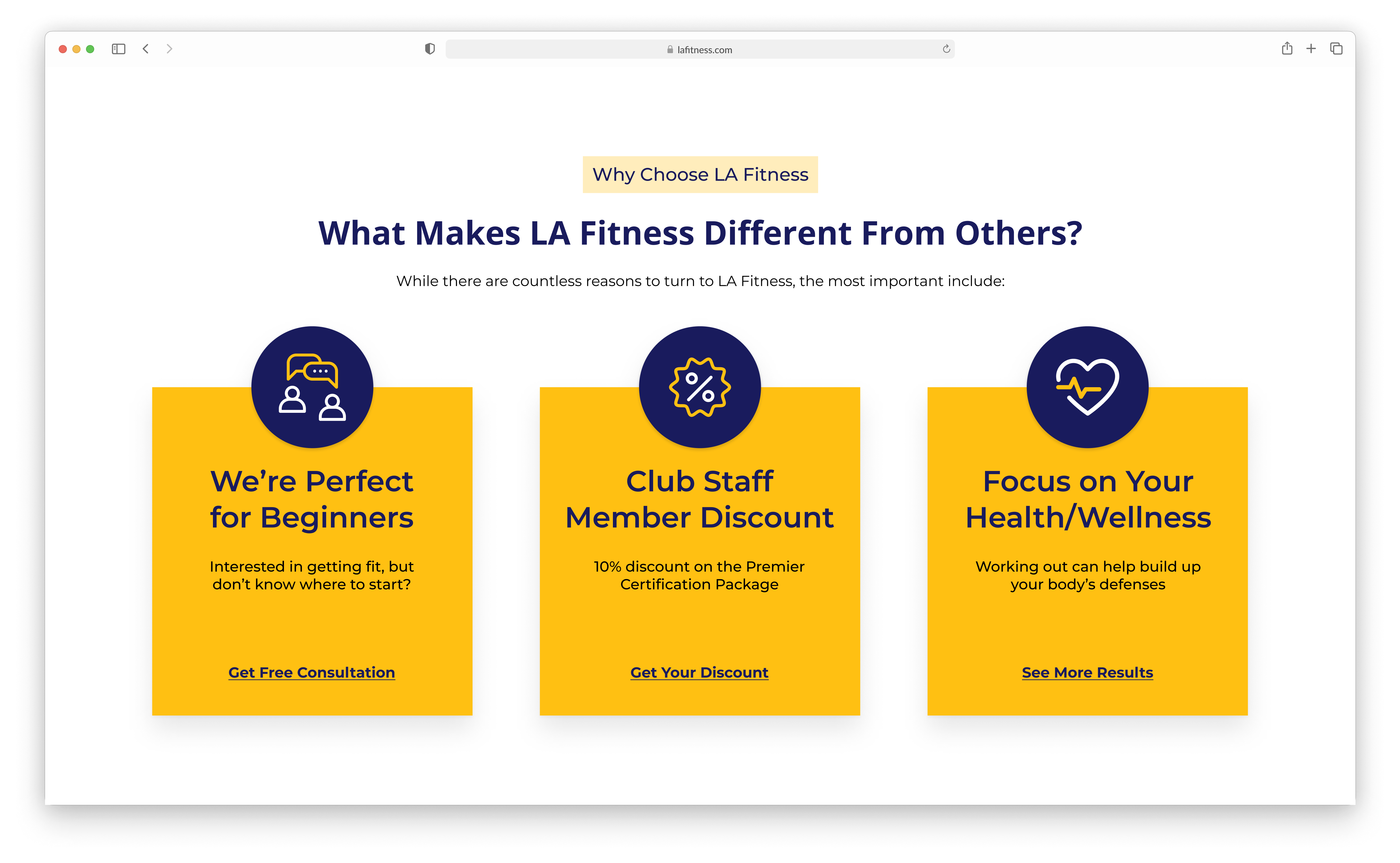
There were important features for me to improve in order to address the pain points that LA Fitness encountered especially around the user journey when visiting the site to access common actions like the class schedule, membership, and pricing transparency. I determined that my main objective was to ease these activities. The site’s cluttered menu makes it hard to find key info like locations, memberships, and class schedules. Pricing isn’t clear, often hidden behind forms, which frustrates users. Booking classes and managing memberships feels complicated, with too many steps and little guidance.
Solution
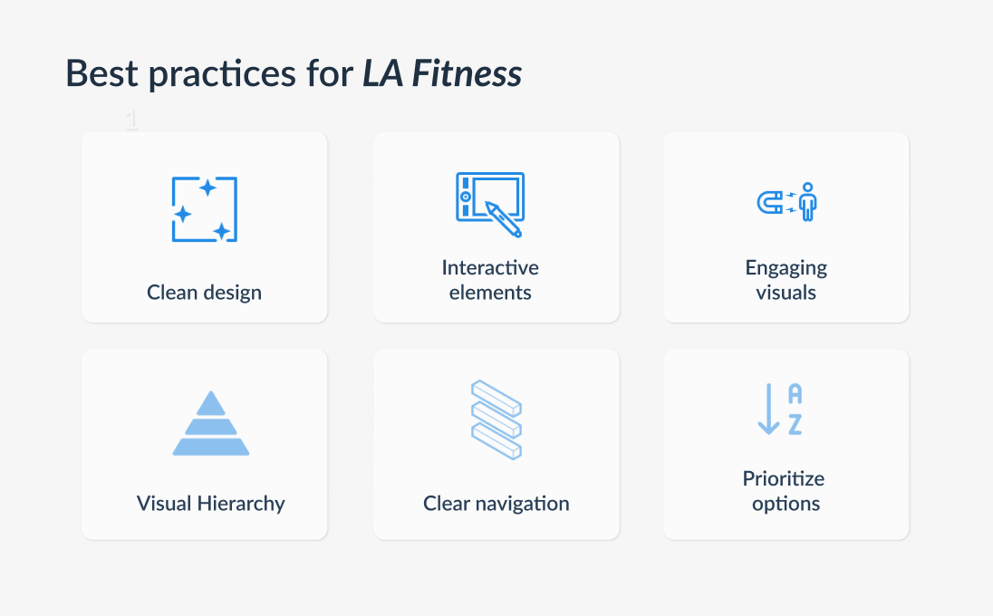
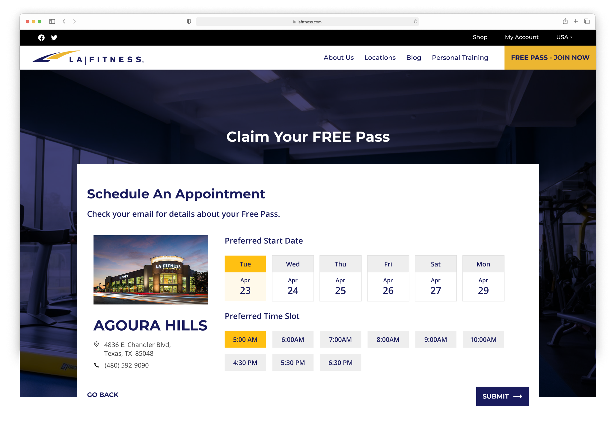
I redesigned the LA Fitness website to fix major pain points that frustrated users, especially when trying to check class schedules, explore memberships, and find pricing information. My main goal was to make these tasks easier and more intuitive.
The old site had a cluttered menu that made it hard to find key information. Membership pricing wasn’t clear, it was often hidden behind forms, which annoyed users. Booking a class or managing a membership felt complicated, requiring too many steps without clear guidance.
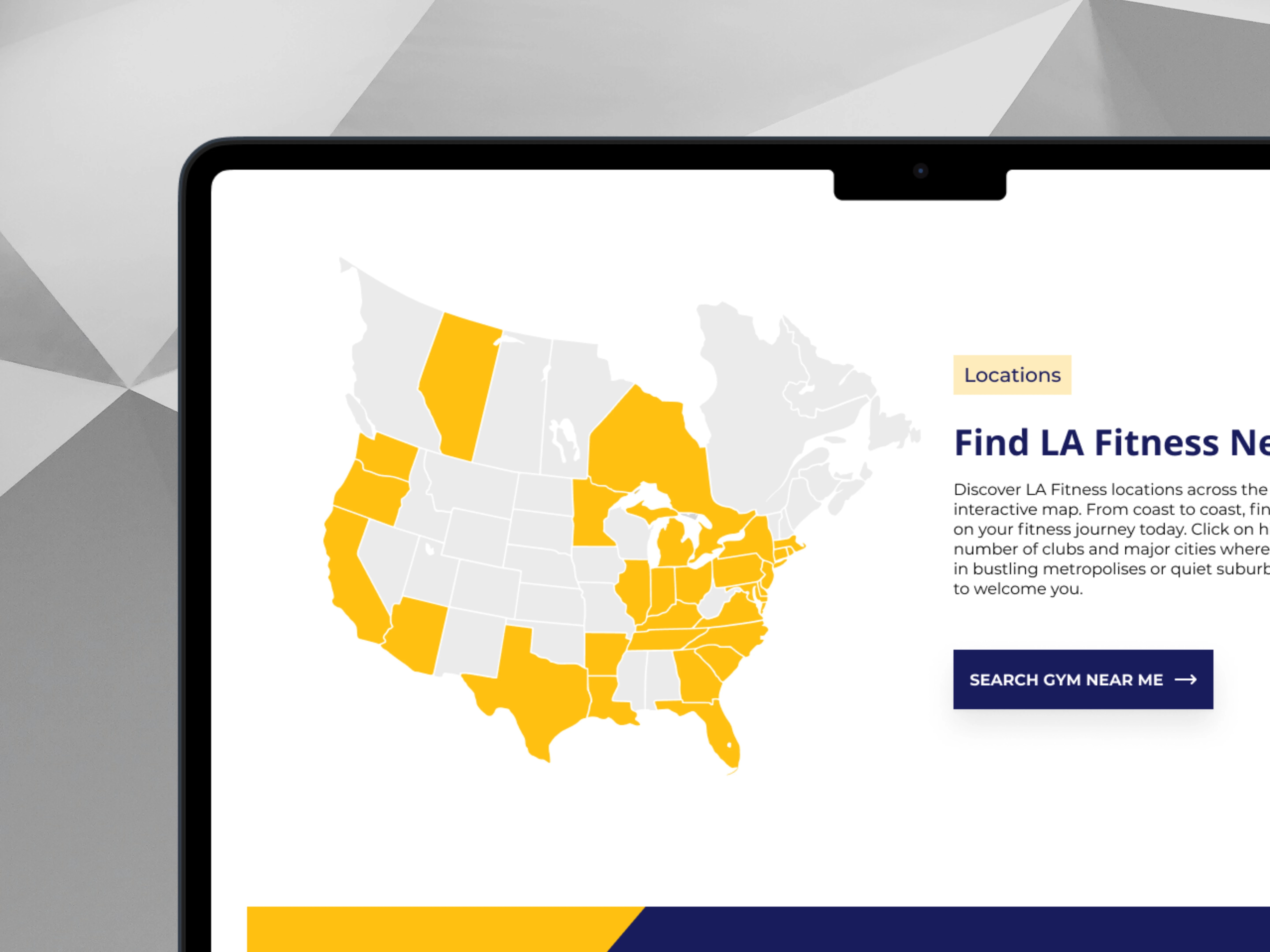
To improve this, I streamlined the navigation, making key sections easy to find. I redesigned the pricing page to be more transparent, removing unnecessary steps. The class booking process was simplified so users could register in fewer clicks.
I also improved the homepage by turning it into a user-friendly hub where visitors can quickly access important actions. Instead of forcing users to dig through multiple pages, everything is now structured logically, making the experience smoother and frustration free.


What I'd do differently next time
I envisioned a dashboard where members could see upcoming classes, billing info and progress tracking in one place. Because of scope limitations I focused on improving general navigation instead. In a future iteration I’d integrate more personalized features to enhance retention.
