Plymouth Rock Assurance | Insurance
Plymouth Rock Assurance app was redesigned to help alleviate the pain in getting a quote, file a claim, and find an agent easily on the spot.
App Design
Insurance


Overview
Plymouth Rock Assurance provides insurance solutions, but its mobile app was falling behind in both design and user experience. The app hadn’t been updated in a while and it made the app harder to use than they should be. As the designer in this academic project, my role was to refine the app’s experience, simplify navigation, and make it easier for users to manage their insurance.
Challenge
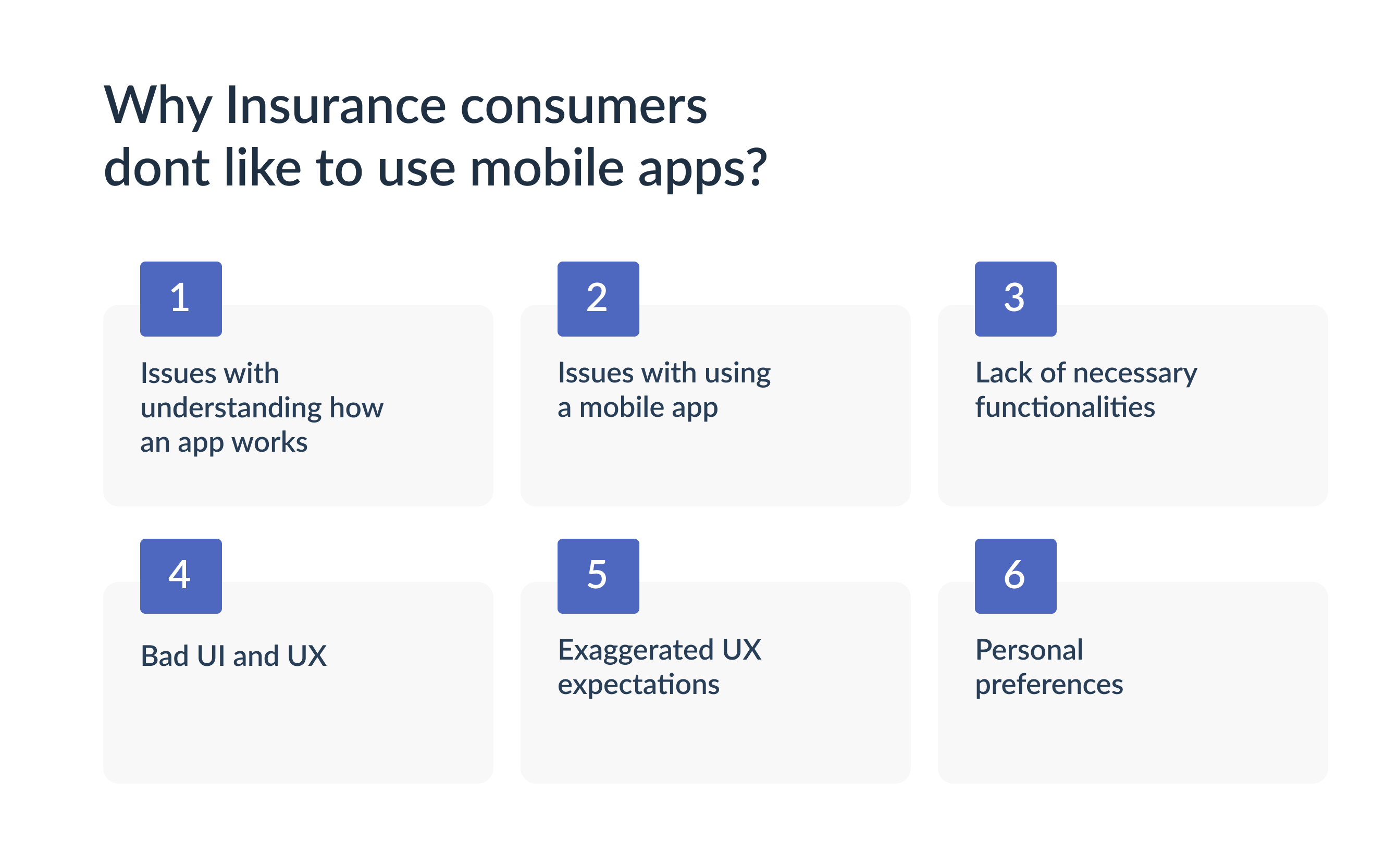
Some of the major pain points were a lack of focus on important features like get a quote and I noticed the app didn’t guide users effectively to pay bills or file claims, and some features felt out of place. Visually, there was also a lack of hierarchy and priority in the way information was presented.
I focused on design elements to make sure quick and easy access to key sections like Get a Quote, Claims, and Billing because these are the most important options for someone visiting an insurance app. I also prioritized large touch targets to make sure buttons are easy to tap, even for older users, as an insurance company's clientele can range from young to elderly users.

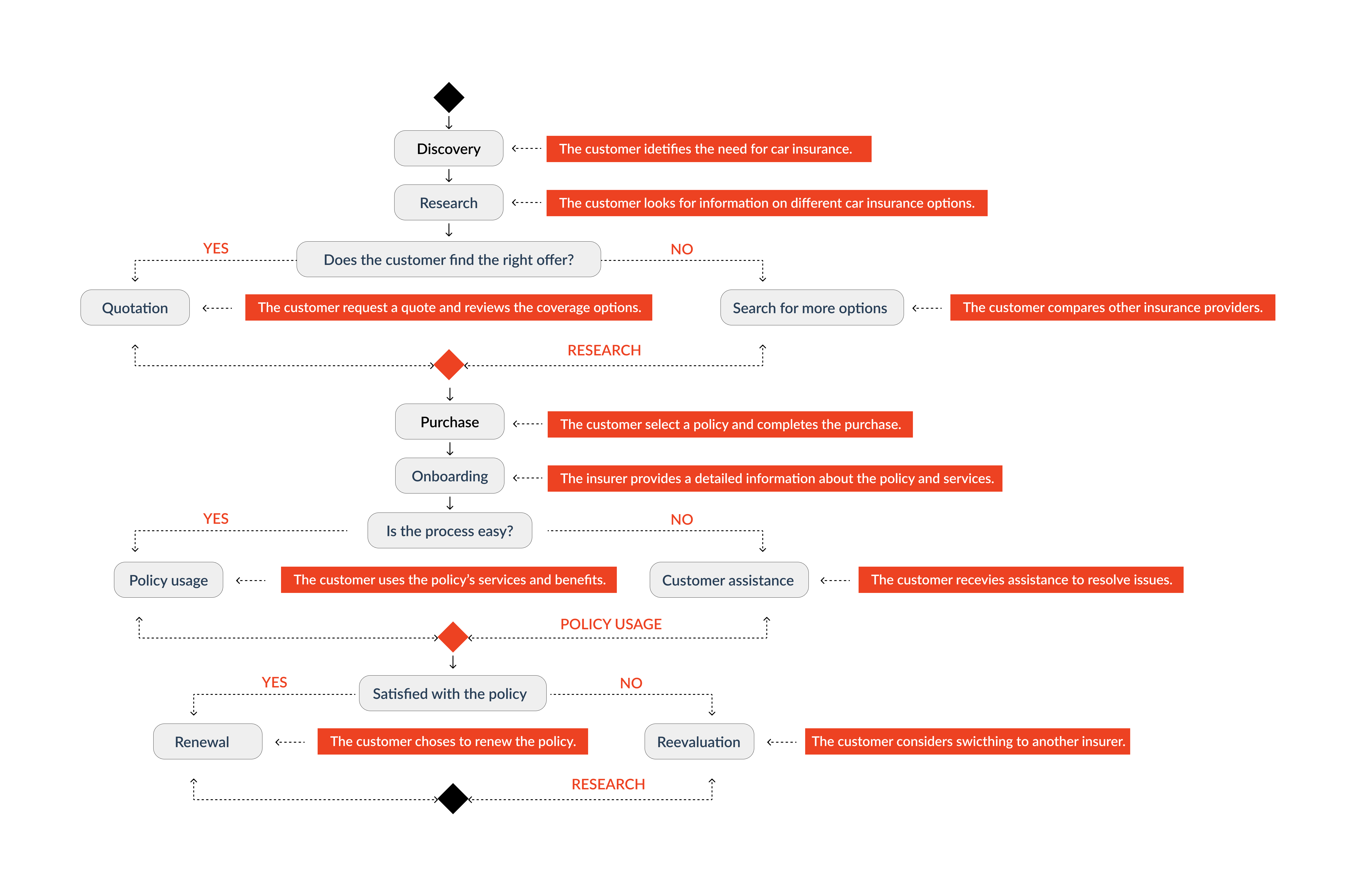
The Customer Journey Map
Through my research, I identified the importance of the Customer Journey Map in the insurance industry, especially in understanding customer pain points and opportunities. Insurance companies like Plymouth Rock are increasingly facing the need to adapt to technological advancements and evolving consumer expectations. I analyzed the customer journey and was able to identify some pain points like complicated navigation and unclear steps during the claims process. I also saw opportunities to make things simpler, like improving the access to important actions, such as getting a quote, filing a claim, or making a payment. I made these changes to create a better experience, help customers find what they need quickly, and ultimately build trust and loyalty with the company.
Solution
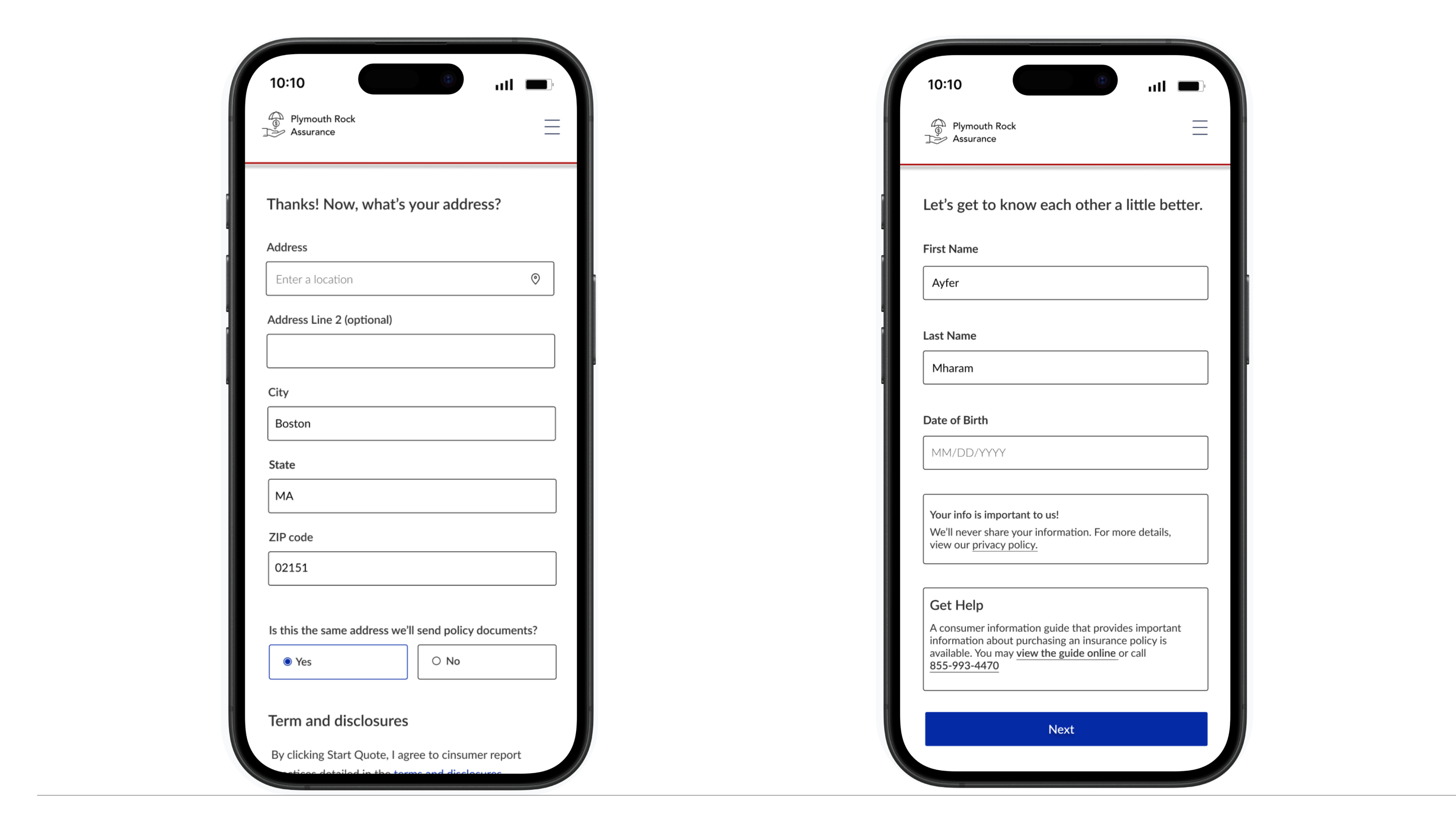
My solution was to simplify the app’s layout and navigation, I focused on making main functions like get a quote, bill payment, and claims filing more accessible. I also reorganized the information to create a clearer visual hierarchy, and make it easier for users to find and prioritize the most important tasks.


Result
What stood out most during this project was the need for simplicity. The app’s complexity was frustrating, so I focused on making everything more straightforward. I made the app easier to use and less overwhelming by rethinking navigation and highlighting the most important features.
Improve Navigation
I learned that users wanted a simpler way to access. To improve this, I focused on simplifying the layout and smoothed the navigation to reduce confusion.
Improve Actionability
The app previously had features that felt out of place and unnecessary, so I eliminated those to focus on what mattered.
